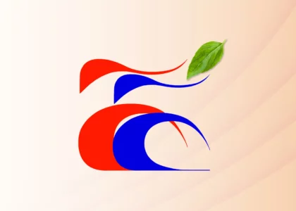
IllusionFX was approached by Spes Manning Solutions, a human resource company with 13 years of operation, to redesign their logo. The client desired a new logo that effectively conveyed their brand essence, incorporating elements symbolizing hope, careers, and job opportunities. The name ‘Spes’ meaning ‘Hope’ in Latin served as a central theme for the design.
Project Objectives:
- Create a modern and distinctive logo for Spes Manning Solutions.
- Incorporate elements that represent hope, careers, and job opportunities.
- Develop multiple design options to cater to the client’s preferences.
- Ensure the logo aligns with the company’s values and mission.
Project Phases:
1. Research and Conceptualization:
- Understanding the client’s business, history, and values.
- Analyzing the HR industry and competitors’ logos.
- Brainstorming and sketching initial design concepts.
2. Design Development:
- Creating multiple design options with various design languages.
- Experimenting with different symbols and typography.
- Focusing on conveying hope, happiness, careers, and job opportunities.
3. Client Collaboration:
- Presenting initial design concepts to the client.
- Gathering feedback and preferences.
- Iterating on the designs based on client input.
4. Final Design Selection:
- Narrowing down design options.
- Fine-tuning the selected design based on client feedback.
- Ensuring the logo is versatile and adaptable for various applications.
5. Design Execution:
- Refining the chosen design.
- Creating high-resolution versions suitable for print and digital use.
- Developing color variations and ensuring readability in different contexts.
6. Presentation to the Client:
- Presenting the final logo design to Spes Manning Solutions.
- Discussing guidelines for logo usage and brand consistency.
- Receiving client approval for the design.
7. Delivery:
- Providing the client with all necessary logo files (vector, PNG, JPEG, etc.).
- Including a brand guidelines document for consistent usage.
- Assisting with the implementation of the new logo as needed.
Logo Description:
The final logo chosen for Spes Manning Solutions incorporates several elements that align with the client’s objectives:
- Tree Symbol: Represents hope, growth, and strength.
- Two Figures: Symbolize happiness and partnership in finding new job opportunities.
- Briefcase: Signifies job and career opportunities, emphasizing the company’s HR services.
- Modern Typography: Offers a contemporary, professional look while highlighting the brand name.
Additional Project Components: Brand Identity Kit Theme and Brand Guidelines
In addition to the logo design project, IllusionFX also undertook the development of a comprehensive Brand Identity Kit Theme and Brand Guidelines for Spes Manning Solutions. These elements play a crucial role in maintaining consistency and ensuring the effective application of the new logo across various mediums and materials.
Brand Identity Kit Theme: The Brand Identity Kit Theme encompasses a wide range of marketing collateral and promotional materials that reflect the new visual identity of Spes Manning Solutions. These materials include:
- Banners: Large format banners designed for events, trade shows, and corporate gatherings. These banners incorporate the new logo and key branding elements to make a strong visual impact.
- Standees: Portable and eye-catching standees that can be used at events, conferences, and in the office environment. These standees reinforce the brand’s presence and messaging.
- Business Cards: Professionally designed business cards with the new logo and corporate colors. These cards are a vital tool for networking and leave a lasting impression on clients and partners.
- Bottles, Mugs, and Pens: Branded merchandise like water bottles, mugs, and pens featuring the Spes Manning Solutions logo. These items serve as promotional giveaways and enhance brand visibility.
- ID Cards: Custom-designed identification cards for employees, featuring the new logo and a consistent design theme. ID cards contribute to a cohesive and professional corporate image.
- Envelopes: Branded envelopes for official correspondence, enhancing brand recognition even before the content is revealed.
- Letterheads: Professionally designed letterheads that carry the new branding elements, creating a polished and unified look for official documents.
- Report Covers: Custom report covers with the logo and design theme, adding a professional touch to reports, proposals, and other corporate documents.
Brand Guidelines: The Brand Guidelines serve as a comprehensive manual that outlines how the Spes Manning Solutions logo and associated branding elements should be used across all media and materials. These guidelines cover:
- Logo Usage: Detailed instructions on how to use the logo correctly, including minimum size requirements, spacing, and color variations.
- Clearspaces: Clear guidelines on the minimum clear space that must be maintained around the logo to ensure its visibility and impact.
- Color Palette: The approved color palette, specifying primary and secondary colors, along with their Pantone, RGB, and CMYK values.
- Typography: Recommendations for fonts and typography styles to maintain consistency in all written communication.
- Imagery: Guidance on the types of imagery that should be used to complement the brand identity and evoke the desired emotions.
- Usage Do’s and Don’ts: A list of best practices and common mistakes to avoid when using the logo and branding elements.
- Examples: Visual examples of correct and incorrect logo usage in various contexts.
- Templates: Providing downloadable templates for various materials, such as letterheads and business cards, to ensure consistent branding application.
Conclusion:
The logo design project for Spes Manning Solutions by IllusionFX successfully achieved its objectives. The final logo effectively captures the essence of hope, careers, and job opportunities, aligning with the company’s mission and values. The collaborative approach with the client ensured that their vision was incorporated into the design. The versatile logo and brand guidelines provide Spes Manning Solutions with a strong visual identity to move forward confidently in their industry. The development of the Brand Identity Kit Theme and Brand Guidelines for Spes Manning Solutions complements the logo design project by providing the client with a comprehensive toolkit for maintaining a strong and cohesive brand identity. These materials ensure that the new logo and branding elements are consistently and effectively applied across all touchpoints, strengthening Spes Manning Solutions’ position in the market and enhancing brand recognition.


